Showing posts with label art. Show all posts

Thursday, 3 August 2017

Review: Hokusai: Beyond the Great Wave

Hokusai: Beyond the Great Wave has been a massive success for the British Museum: it is virtually sold out, and it is consistently rammed. So, what's the fuss about?
The British Museum say:
Katsushika Hokusai (1760–1849) is widely regarded as one of Japan’s most famous and influential artists. He produced works of astonishing quality right up until his death at the age of 90. This new exhibition will lead you on an artistic journey through the last 30 years of Hokusai’s life – a time when he produced some of his most memorable masterpieces.
Throughout the exhibition, outstanding examples of Hokusai’s work will show the artist’s creative breadth and depth. A selection of superb landscapes is introduced with the iconic Great Wave – itself part of a print series of views of Mt Fuji. Intimate domestic scenes capture fleeting moments in private lives. Exquisite depictions of flora and fauna display an innate skill in representing the natural world. The artist’s imagination is given full rein in the portrayal of supernatural creatures such as ghosts and deities. Through all of these works, explore Hokusai’s personal beliefs and gain a fascinating insight into the artist’s spiritual and artistic quest in his later years.
The exhibition will include prints, paintings and illustrated books, many of which are on loan from Japan, Europe and the USA. This is a once-in-a-lifetime opportunity to see these extraordinary works together.
I found that the exhibition was a really interesting insight into one man developing his artistic practice. It also does a lot to demonstrate why we should look beyond that one image an artist is famous for.

Hokusai was driven by the desire to become better and better at his art, and you can see, as the exhibition progresses, the 'Great Wave' of the title only falls about halfway through the journey of his latter years. His style is beautiful, and his talent is indisputable, so I was really excited to learn more about the breadth of Hokusai's work, as he is not an artist with which I am particularly familiar. The show opened up a whole new artistic and symbolic culture to me, and I enjoyed it a lot, despite the busyness. The 'Great Wave,' interestingly, is only a small print, compared to some of his massive paintings, but it was fascinating to see how intricate it is, up close.

If you can get tickets - which may prove impossible at this stage - you should definitely get down to the British Museum and check it out, although be prepared to get jostled around, and have a wait to see key pieces: it is a very busy exhibition in quite a narrow space, which some are finding very frustrating.

4/5: A rolling success
British Museum
Until 13th August

Tuesday, 1 August 2017

Review: Dreamers Awake

Ah, the summer holidays. Time to catch up on all of the shows I've been dying to see, but haven't had chance to yet...

First off, Dreamers Awake, the current exhibition at the White Cube, Bermondsey. The gallery say (in some detail):
White Cube is pleased to present ‘Dreamers Awake’, a group show at White Cube Bermondsey which explores the enduring influence of Surrealism through the work of more than fifty women artists. The exhibition brings together sculpture, painting, collage, photography and drawing from the 1930s to the present day and includes work by well-known Surrealist figures as well as contemporary and emerging artists. Woman has a powerful presence in Surrealism. She is the object of masculine desire and fantasy; a harpy, goddess or sphinx; a mystery or threat. Often, she appears decapitated, distorted, trussed up. Fearsome or fetishized, she is always the ‘other’. From today’s perspective, gender politics can seem the unlikely blind spot of a movement that declared war on patriarchal society, convention and conformity.
Nonetheless, from its earliest days female artists have been drawn to Surrealism’s emphasis on personal and artistic freedoms and to the creative potential that the exploration of the unconscious offered. By focusing on the work of women artists, ‘Dreamers Awake’ hopes to show how, through art foregrounding bodily experience, the symbolic woman of Surrealism is refigured as a creative, sentient, thinking being.
Repossessed by its owner, the fragmented, headless body of Surrealism becomes a vehicle for irony, resistance, humour and self-expression. Ranging beyond those who might identify themselves as Surrealists, the show traces the influence of the movement where artists delve into the unconscious; create alternative realities; invent fetishistic objects, such as Mona Hatoum’s Jardin Public (1993), that subvert the objectification of the female form, or, in the spirit of Claude Cahun’s iconic black and white self-portraits from the 1930s, play with gender identity as a fluid construct.
My first impression was that Dreamers Awake represented a particularly strong showing of work by women. Exploring the ideas of surrealism, it's a bold reclamation of a genre that has historically objectified the female form, so the work on show feels very powerful.

If you think about the images you connect with the idea of 'surrealism,' once you get beyond melting clocks, you probably call to mind close-cropped images of the body, or even oddly-disembodied limbs: for the Surrealists, the bodies of women were part of their language of expression. What Dreamers Awake does is return a sense of agency to women so they can make the symbolism of surrealism their own mode of expression.
The diversity of the ways in which this expression achieved is stunning; a painting by Dorothea Tanning, photography by Claude Cahun, and sculpture by Louise Bourgeois draw the mind in different directions, whilst circling back round to the concerns of identity and gender. The body of work on show is divergent, but the overall point of the exhibition holds it together with a clear sense of narrative.

I really enjoyed this show, and not just for the quality of the art. The fact that this major exhibitions is female-focused offered an exciting insight into an area of art that everyone thinks they know. As far as I'm concerned, it is well worth seeing.


4/5: A glorious wakeup call from the women of Surrealism
White Cube,
Bermondsey.
Until 17th September

Sunday, 30 July 2017

Review: Selfie to Self Expression

The current major show at the Saatchi Gallery, From Selfie to Self-Expression, is an interesting one: it explores the selfie, and self-portraiture, from art history to today. In other words, the Gallery have hit upon a topic that virtually everyone will have a strong opinion on, which, by contrast, makes it quite difficult to review thoughtfully.

The Gallery say:
Saatchi Gallery and Huawei have teamed up to present From Selfie to Self-Expression. This is the world’s first exhibition exploring the history of the selfie from the old masters to the present day, and celebrates the truly creative potential of a form of expression often derided for its inanity.

The show also highlights the emerging role of the mobile phone as an artistic medium for self-expression by commissioning ten exciting young British photographers to create new works using Huawei’s newest breakthrough dual lens smartphones co-engineered with Leica.
 
When I left this exhibition, I wasn't sure whether I'd witnessed a playful, clever review of the state of modern image production, or whether I was witnessing a manifestation of the end of days. I'm still not sure.
It is clear that a lot of thought has gone into the installations, and that everything included is there to spark some serious debate. Whatever your opinion of selfie culture, however, the curator has done a very good job of drawing parallels with portraiture from art history, so the exhibition isn't a study in isolated tackiness.
There's a mix of photography from established artists, large scale installation work, and, of course, both researched and crowd-sourced selfies. As a whole show it has a good balance to it, and explores the idea of self-expression in a surprising amount of intellectual depth for a show with 'selfie' in the title.
Overall, I think that Selfie to Self-Expression is worth seeing so you can wrap your own opinions around it. The issues it deals with are too contentious for any one reviewer to offer a definitive statement on, so I'm not going to try to. I still don't know if I loved or hated it, but I definitely engaged with it. It is worth your time, if only to give you something to argue over.

4/5: Irresistible debate-fodder
Saatchi Gallery
Until 6th September

Saturday, 15 July 2017

Reviewing: Giacometti

This is the second Giacometti exhibition in London of late - the NPG's 'Pure Presence' show fell in the 2015/16 season and was very well received - so there is clearly an appetite for his work in the capital.
Of this exhibition, the Tate Modern say:
Celebrated as a sculptor, painter and draughtsman, Giacometti’s distinctive elongated figures are some of the most instantly recognisable works of modern art. This exhibition reasserts Giacometti’s place alongside the likes of Matisse, Picasso and Degas as one of the great painter-sculptors of the twentieth century. Through unparalleled access to the extraordinary collection and archive of the Fondation Alberto et Annette Giacometti, Paris, Tate Modern’s ambitious and wide-ranging exhibition brings together over 250 works. It includes rarely seen plasters and drawings which have never been exhibited before and showcases the full evolution of Giacometti’s career across five decades, from early works such as Head of a Woman [Flora Mayo] 1926 to iconic bronze sculptures such as Walking Man I 1960.
As the description explains, this exhibition works in broader strokes than the showing at the NPG, and as such gives a much more well-rounded view of the artist. You get to see his sketches, paintings and, of course, his sculpture.

His sketches and paintings are beguiling and complex, holding your attention as you try and figure out exactly what is being said, but, for me, it is the sculptural work where Giacometti's magic is most evident. He completed pieces on a tiny scale, whilst also producing huge works that tower over the spectator. His unique visual signature is said to explore the figure in the post-war era, everything irrelevant stripped away, but whatever is going on, the nature of his work is just mesmerising.

It is the first time a London audience has had the opportunity to see so much of Giacometti's work in one place, and it really gives you the opportunity to see his style and thinking evolve over time. The final encounter with his huge figurative work sends you out of the exhibition with a sense of his phenomenal talent and huge influence on the art world.

I thoroughly enjoyed the whole exhibition, and definitely recommend it. It is very rare for you to get such a detailed insight into a true master.

4/5: A powerful exploration of a life in art
Tate Modern
Until 10th September

Sunday, 9 July 2017

Reviewing: Fahrelnissa Zeid

This week I took in a double bill of Tate Modern shows: Giacometti and Fahrelnissa Zeid. Of the two, Zeid's work was the most surprising, as she was a completely new artist to me - I got a ticket for her show on a whim when I went to see Giacomettii - but she proved to be a marvellous discovery.
Of Zeid, the Tate Modern say:
Trained in both Paris and Istanbul, Fahrelnissa Zeid was an important figure in the Turkish avant-garde d Group in the early 1940s and the École de Paris (School of Paris) in the 1950s. Her vibrant abstract paintings are a synthesis of Islamic, Byzantine, Arab and Persian influences fused with European approaches to abstraction. Many of her abstract works are monumental and demand attention.
Zeid’s reputation as an artist was cemented in the 1950s when she was living between London and Paris and exhibiting extensively internationally. The artist also began experimenting with painting on turkey and chicken bones, which she later cast in polyester resin panels evocative of stained-glass windows. In the later years of her life she unexpectedly returned to figurative painting, creating stylised portraits of her friends and family.
Indulge in Zeid’s obsession with line and dazzling colour in this exhibition. Rediscover one of the greatest female artists of the 20th century in this first major retrospective.​
Internationally trained and widely recognised in her contemporary moment, Zeid has since - as the exhibition points out - fallen from view. I, for one, am glad the Tate Modern has decided to take steps to bring her work out of obscurity, as I was stunned by the power of her painting, and want to see more of her.

Aside from exploring her fascinating life story,  the show charts her artistic development and showcases the raw emotion and scale of her work. Though there are some smaller works, a lot of what she paints is dramatic in size, and her use of colour, line, and pattern is nothing short of striking.

The huge abstract canvases draw you in, and it feels like there is something recognisable hidden in the patterns, if only you could stare at them for long enough. Her portraiture does nothing for me, but her use of colour across everything in the show is pure magic.

Overall, Zeid's retrospective is well worth catching.

4/5:Vibrant and hypnotic
Tate Modern
Until 8th October

Thursday, 29 June 2017

Review: Gregory Crewdson: Cathedral of the Pines

 Cathedral of the Pines is really quite something. Exploring Gregory Crewdson's mysterious and deeply narrative body of work, this is the collection's first UK exhibition.

 The Photographers' Gallery - Cathedral of the Pines' current home - say:
With this series, produced between 2013 and 2014, Crewdson departs from his interest in uncanny suburban subjects and explores human relations within more natural environments. In images that recall nineteenth-century American and European paintings, Crewdson photographs figures posing within the small rural town of Becket, Massachusetts, and its vast surrounding forests, including the actual trail from which the series takes its title. Interior scenes charged with ambiguous narratives probe tensions between human connection and separation, intimacy and isolation.

Crewdson describes this project as ‘his most personal’, venturing to retrieve in the remote setting of the forest, a reminiscence of his childhood. The images in Cathedral of the Pines, located in the dystopian landscape of the anxious American imagination, create atmospheric scenes, many featuring local residents, and for the first time in Crewdson’s work, friends and family. In Woman at Sink, a woman pauses from her domestic chores, lost in thought. In Pickup Truck, Crewdson shows a nude couple in the flatbed of a truck in a dense forest—the woman seated, the man turned away in repose. Crewdson situates his disconsolate subjects in familiar settings, yet their cryptic actions—standing still in the snow, or nude on a riverbank—hint at invisible challenges. Precisely what these challenges are, and what fate awaits these anonymous figures, are left to the viewer's imagination.

Crewdson's careful crafting of visual suspense conjures forebears such as Diane Arbus, Alfred Hitchcock, and Edward Hopper, as well as the influence of Hollywood cinema and directors such as David Lynch. In Cathedral of the Pines, Crewdson's persistent psychological leitmotifs evolve into intimate figurative dramas.

Visually alluring and often deeply disquieting, these tableaux are the result of an intricate production process: For more than twenty years, Crewdson has used the streets and interiors of small-town America as settings for photographic incarnations of the uncanny. Working with a large crew, he plans his images as meticulously as any movie director.
The results of this intricate process are spectacular.

The links made between Crewdson's work and Twin Peaks seem wholly justified when you arrive amongst huge photographs of small-town America, populated with strangely disconnected people. The images have stories that beg to be told, and everything about them is otherworldly and beguiling. I was completely mesmerised by them.

The technical side of the photography is equally impressive. The amount of work Gregory Crewdson puts into staging the shots is absolutely immense - they are cinematic in scale as has already been pointed out - and the slide show of 'behind-the-scenes' photographs is illuminating as to exactly how much effort is required for the images to be created.

The exhibition as a whole thing is well-curated, and the body of work sits nicely across the three floors of the space. The Photographers' Gallery is a venue I cannot praise highly enough for not only the quality of their exhibitions, but also the gallery as a whole - it's welcoming, the cafe is good and shop ruinously well-stocked.

As someone with an active interest in photography I engaged with Cathedral of the Pines on the levels of both story and technique; these contrasting elements are equally captivating. However, even if you're not a regular photographer yourself, there is a lot to work with in this exhibition: I recommend it highly. Go get yourself lost.

5/5: It's strange and it's beautiful
The Photographer's Gallery
Soho
Until 8th October 2017

Wednesday, 21 June 2017

Review: Into the Unknown

The Barbican are currently hosting a huge exhibition exploring the genre of scifi. They're describing it like so:
The genre-defining exhibition of art, design, film and literature.
From the 19th century cabinet of curiosities, to the vastness of space. Through future cities, into the inner landscapes of human perception.
Uncover the mysterious lands of Jules Verne and Ray Harryhausen where Science Fiction narratives first took root. Venture on an odyssey into our solar system, with vintage artwork promoting Soviet visions of space alongside immersive work by Soda_Jerk. Visit a gallery of aliens, and stand alongside iconic spacesuits from a galaxy of blockbusters including Star Trek and Interstellar.
Imagine dystopian worlds with Margaret Atwood and 28 Days Later. Then, with nowhere left to explore but human consciousness, delve deep and experience the transformation and mutation of the body through the eyes of Jack Kirby and Ex Machina.
Curated by historian and writer Patrick Gyger, this festival-style exhibition consists of more than 800 works, many of which have never been seen in the UK before. Continuing across the Centre, it includes artwork from Isaac Julien, Larissa Sansour and Conrad Shawcross, and an installation from the creators of Black Mirror.
And it's incredible!

Into the Unknown is a glorious and detailed exhibition, filling the Barbican's Curve gallery to the brim and then extending its tendrils out through the whole building, with additional exhibits in the Foyer and the Pit theatre.

The amount of content in the main Curve space is immense: it's more than you can realistically take in in one visit. If you're a scifi fan, you'll feel like you've died and gone to geek heaven, but even if it's not your genre of choice, it's still a fascinating look at the evolution of design in the field.

The artworks outside of The Curve are intriguing, and offer a balance to the exhibition, making sure it rises above just being a collection of memorabilia. As a result, Into the Unknown feels exciting and relevant.

Overall, Into the Unknown is yet another example of how good the Barbican are at designing the 'experience' of art exhibitions, beyond just hanging things on walls. Highly recommended.

4/5: A whole other world of style and substance
The Curve: Barbican
Until 2nd September

Saturday, 22 April 2017

Review: American Dream: Pop to the Present


Yesterday, pretty much on a whim, I diverted into the British Museum and got a ticket for their The American Dream: Pop to the Present exhibition. I am really, really glad I did. Printmaking isn't really an area I know a lot about, either in terms of technique or practitioners, so American Dream offered both a steep learning curve, and an insight into a lot of really exciting work.

The exhibition is being promoted like so:

America.
Land of the free. Home of the brave…
Trace 60 years of a superpower in this major new exhibition.

The past six decades have been among the most dynamic and turbulent in US history, from JFK’s assassination, Apollo 11 and Vietnam to the AIDS crisis, racism and gender politics. Responding to the changing times, American artists have produced prints unprecedented in their scale and ambition.
...
This exhibition presents the Museum’s outstanding collection of modern and contemporary American prints for the first time. These will be shown with important works from museums and private collections around the world.
The full description, available here, is quite detailed, and makes very clear how the British Museum are framing the show. The theme of politics is threaded through the work, sometimes subtly, sometime overtly, whilst each room represents the next evolutionary stage in the history of American printmaking. In the past, I've gone to exhibitions at the British Museum where, having paid for a full price adult ticket, I've walked through about three rooms of content, reached the end, and then gone, 'Is that is?' This was definitely not the case here. American Dream is a huge, detailed exhibition, so if you're thinking about going, make sure you leave enough time to fully take things in.

There is too much work in the show for me to talk in detail about all of it, but there were a few highlights that really stood out for me. Jasper Johns and Robert Rauschenberg were well represented in American Dream, and seeing their work up close was particularly exciting as you can see their artistic practice play out over time. Chuck Close's portraiture was a masterclass of technique, and the stripped back minimalism of Donald Judd and Al Taylor articulated a reaction against both abstract expressionism as a highly personal form and pop art as an ironic gesture, representing how trends in printmaking have shifted in the past few decades. As I have already noted, though, these are just a few of the amazing pieces on offer.

American Dream is a well-curated, detailed exhibition, that treats the recent history of American printmaking with an appropriate level of care and attention. I learnt about this particular area of art history, as well as enjoying the work, and I would definitely advise you to make time to do the same.

5/5: Bold, brave and beautiful
The British Museum,
London.
Until 18th June

Tuesday, 18 April 2017

Review: Eduardo Paolozzi

A retrospective of Eduardo Paolozzi's work is currently on show at East London's Whitechapel Gallery. Before visiting the exhibition, I didn't think I knew who Paolozzi was, but it turns out that I see his work on a near-weekly basis at both the British Library, and at Tottenham Court Road tube station. The Whitechapel Gallery introduce the exhibition like so:
Eduardo Paolozzi (1924-2005) was one of the most innovative and irreverent artists of the 20th century. Considered the ‘godfather of Pop Art’, his collages, sculptures and prints challenged artistic convention, from the 1950s through to the Swinging Sixties and advent of ‘Cool Britannia’ in the 1990s.
This major Eduardo Paolozzi retrospective spans five decades and features over 250 works; from the artist’s post-War bronzes, revolutionary screen-prints and collages, to his bold textiles and fashion designs.
Alongside Paolozzi’s early brutalist concrete sculptures, highlights include material from his groundbreaking performance lecture Bunk! (1952), his large-scale Whitworth Tapestry (1967) and the iconic sculpture Diana as an Engine (1963).
I wasn't really captured by images used on the promotional material, but on entering the first room of the exhibition my heart lifted at the colour and variety of the work on show. The combination of sculpture, print, and tapestry gave the show a texture very few artists could realistically offer.

The exhibition moves chronologically through Paolozzi's work, but each of the rooms still contains a mixture of prints, textile work, and sculpture. Highlights for me include some of the later figurative sculpture, and the prints that arose from Paolozzi's friendship with the writer J.G. Ballard.
Other significant moments are offered by the huge Whitworth Tapestry, with its bold colours and presence of Mickey Mouse, and the materials from Paolozzi's 1952 'Bunk!' lecture at the ICA.

Paolozzi's magpie-like adoption of different media makes for a kaleidoscopic, and rather marvellous, experience. It is well worth your time to familiarise yourself with an artist whose work is so present in London, yet whose name is still broadly unknown.

Recommended.

4/5: A colourful, lively retrospective from one of art's polymaths.
Whitechapel Gallery
Until 14 May 2017

Tuesday, 4 April 2017

Review: Behind the Mask, Another Mask

Behind the Mask, Another Mask is one of the current exhibitions at the National Portrait Gallery. It is being advertised with a couple of beguiling, surreal images, that don't necessarily make the nature of the show clear. So what is it?
“Under this mask, another mask. I will never finish removing all these faces.” Claude Cahun, 1930
This exhibition brings together for the first time the work of French artist Claude Cahun and British contemporary artist Gillian Wearing. Although they were born almost seventy years apart and came from different backgrounds, remarkable parallels can be drawn between the two artists. Both of them share a fascination with the self-portrait and use the self-image, through the medium of photography, to explore themes around identity and gender, which is often played out through masquerade and performance.
My first response to the exhibition's entry point was one of a casual interest. There were photographs, they were pleasing, but they didn't really set my world aflame. Some casual links between Wearing and Cahun are suggested, but the connections are quite superficial.
Then it gets weird.
 As the exhibition progresses, we see more of Wearing's mask work, and what she has done seems to sit firmly in 'uncanny valley' territory. When you realise that you aren't looking at straight portraits, but recreations of portraits achieved by Wearing in a mask, the effect is unsettling to say the least. The same eyes stare out from faces of different ages and genders in a manner that made me feel really quite uncomfortable. The juxtaposition with Cahun's work then becomes interesting, as there is a strong dialogue between the politics of identity and the fluidity of self-representation. However, the more showy images of Wearing's are staged in a way that almost overshadows Cahun's work, which is actually the more thought-provoking of the two.
The points of intersection between the two artists could bear more development as there are clear similarities and ideological links. As things stand, though, the two artists' images sit alongside one another, talking to each other too infrequently.

Behind the Mask, Another Mask is worth a visit for thinking through the points Wearing and Cahun are making about identity, but it is a far from perfect exhibition. What makes it frustrating is that it could have been a great show. Instead, it's merely a good one.

3/5: Uncanny but undeveloped
National Portrait Gallery
Until 29th May 2017

Thursday, 23 March 2017

Speechlessness in Three Artworks

Speechless, adjective
unable to speak, especially as the temporary result of shock or strong emotion
I am faithless, but sometimes, when confronting an artwork, I feel as if I'm in church.
On, sadly, rare occasions I enter a gallery and experience a moment of stillness so pure it feels transcendental: my heart races, my head spins, I stop breathing for a moment - speechlessness descends as a gift to someone whose life contains little quiet.

It would be nice to think that we all find moments like this in our lives: times where we connect with something greater and more beautiful than ourselves. Times of quiet. But I am not the only person who has to struggle to escape everyday noise.

At different stages in my life, the following three artworks have rendered me speechless, all for different reasons. The were quiet points, where I had the space to think.

1. Turner's Seascapes:

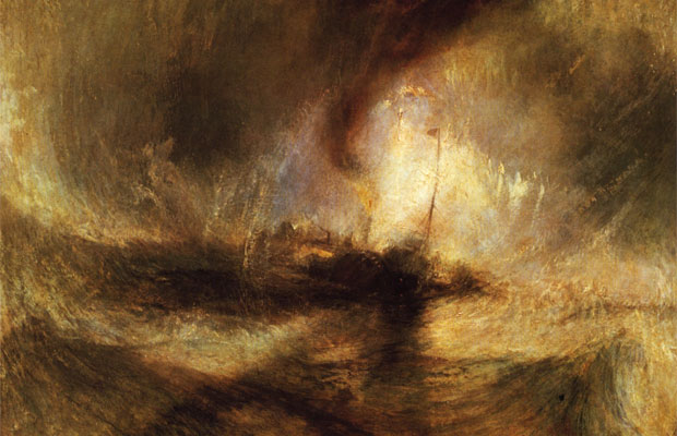
There are examples of Turner's works all over the place in London, but I first fell in love with his seascapes through the 'Turner and the Sea' exhibition at the National Maritime Museum a few years ago. The scale of his late seascapes, stripped of all unnecessary detail, was immense: I felt as if I could be washed away. Turner's courage to pull back details means that you end up with huge, almost abstract canvases, and being surrounded by them is very tranquil.

2. Van Gogh's 'Wheat field with Crows':

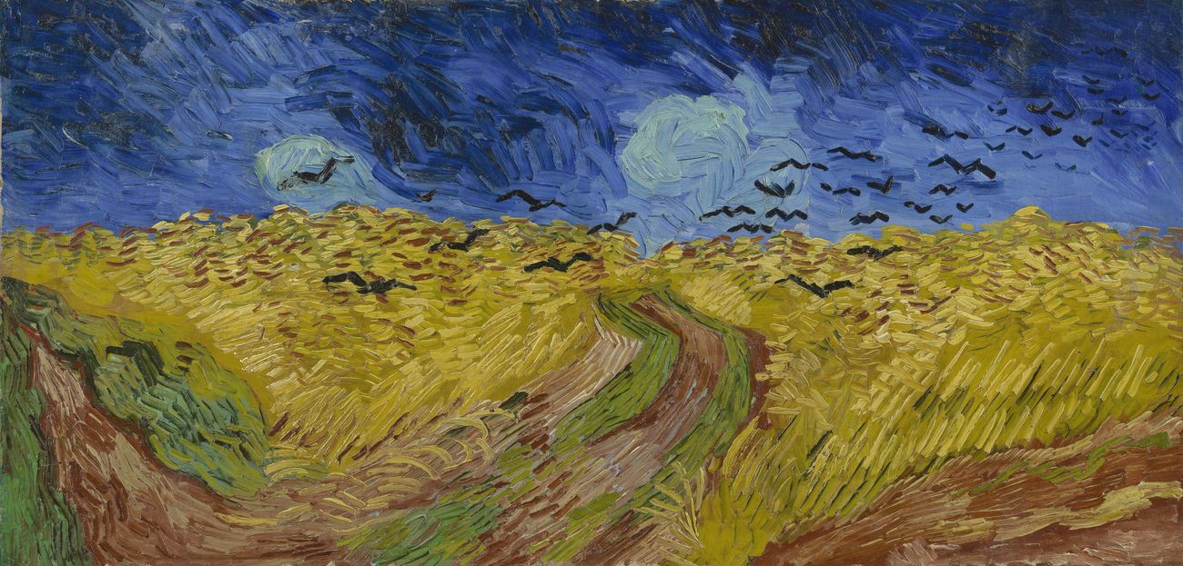
I don't remember when it was I fell for Van Gogh's work, but when I had a brief stopover in Amsterdam for a wedding, I took great delight in going to the Van Gogh museum. The highlight for me was 'Wheat field with Crows', which is a huge canvas that seems to perfectly capture a ripple of disturbance in a field, causing the birds to rise and fly off. I stood staring at the tiny brush strokes, following the movement, until my partner hurried me along. My mind stayed with the painting.

3. Rothko's Seagram Murals:

 My love for Rothko was late in developing. When I studied art at college, I was one of those foolish, pretentious teenagers who thought they had the learning to dismiss abstract expressionism out of hand. Many years, and much maturing, later, and sitting in the room containing the Seagram Murals at the Tate Modern is about as close as I am able to get to a religious experience. You sit in the darkened space and are absolutely surrounded by these massive, abstract canvases. It's well worth waiting for a quiet moment to get in there and claim bench space. It makes me feel small, yet incredibly safe.

What artworks have given you pause? Which artists?

It seems like I don't just look for a single thing in an artwork. It is more a feeling of scale. What I'm looking for, maybe, is something with the scope to put my own life in perspective. Whatever the feeling, it's beyond words.

Sunday, 15 January 2017

Review: The Vulgar

The Vulgar: Fashion Redefined is the current exhibition at the Barbican Centre. They say:
‘Vulgarity exposes the scandal of good taste’ Adam Phillips

Potent, provocative and sometimes shocking, the word vulgar conjures up strong images, ideas and feelings in us all. The Vulgar is the first exhibition to explore the inherently challenging but utterly compelling territory of taste in fashion, from the renaissance through to contemporary design. Examining the constantly evolving notion of vulgarity in fashion whilst revelling in its excesses, you are invited to think again about exactly what makes something vulgar and why it is such a sensitive and contested term.
What this means in practice is that curator Judith Clark and writer/psychoanalyst Adam Phillips - partners in life as well as work - have joined to create a spectacular and challenging display, reflecting on the idea of taste, as viewed through ideas about what constitutes 'vulgar'.
 The exhibition tracks different notions of taste and vulgarity, and each conceptual framing is accompanied by an exhibit of connected fashion pieces or artefacts. The thinking that underpins The Vulgar means that the whole show has a coherence, so it follows that the contrast between relatively simple classical-inspired shifts, and huge baroque ball gowns isn't actually jarring.
Even when you encounter things that you find garish, you are forced to reflect on why this is so and where this prejudice comes from: it is a very clever intellectual twist, which differentiates this exhibition from usual gallery shows centred on fashion.

The intellectual grounding for the exhibition makes it impossible to sign off with a comment along the lines of 'even if it's not to your taste...' But suffice to say if you have an interest in fashion, then you'll get something out of this show, even if you hate the kind of work represented within: check it out.


4/5: Thought-provoking fashion and fashion provoking thought

Barbican Centre
Until 5th February

Thursday, 22 December 2016

Review: Anselm Kiefer - Walhalla

Walhalla is Anselm Kiefer's latest exhibition and, currently situated at White Cube Bermondsey, it is really rather brilliant.
The White Cube have the following to say about it:
Titled ‘Walhalla’, the exhibition refers to the mythical place in Norse mythology, a paradise for those slain in battle, as well as to the Walhalla neo-classical monument, built by Ludwig I King of Bavaria in 1842 to honour heroic figures in German history.
This gives you the context, but does nothing to describe the atmosphere.

You enter a corridor, something that wouldn't be out of place in a field hospital set up during some hellish war: dark, metallic beds line the walls on either side, which, you notice as you get closer, are sometimes labelled with the names of figures from Norse mythology or Germanic folklore. Branching off from this corridor are a series of rooms, some housing paintings, others instillations.

The instillation work is fascinating in its ability to raise questions about well known narratives and subvert any expectation you have about the idea of what 'Valhalla' might be. Everything is grimy, harsh, toxic: you think about what being slain in battle might mean in the contemporary world. Meanwhile, when you depart for the more brightly lit rooms housing the mixed-media paintings, the rawness of the work, combined with their sheer scale, makes for a powerful, almost overwhelming, experience. The diversity of this body of work in terms of technique is at the same time held together by unifying ideas, materials and shapes that echo through all of the rooms. Kiefer has taken an idea and explored it inside and out. The result is jaw-dropping.

Walhalla is one of the best exhibitions I've seen this year, both in terms of scope and ideas, and in its aesthetics and realisation. It is really worth the trip out to Bermondsey to go and explore it for yourself: my brief description here has not done it justice. You only have until February, so get a move on!

5/5 - A mythic combination of installation, sculpture and painting: go and lose yourself in the stories

White Cube Bermondsey
144-152 Bermondsey St
London
SE1 3TQ 


23 November 2016 – 12 February 2017

Wednesday, 21 December 2016

Review: The Radical Eye

The Radical Eye is a Tate Modern exhibition, looking at the impact of Modernist photography on the medium as a whole. The exhibition is described, by the Tate, in the following terms:
This is a once-in-a-lifetime chance to see one of the world’s greatest private collections of photography, drawn from the classic modernist period of the 1920s–50s. An incredible group of Man Ray portraits are exhibited together for the first time, having been brought together by Sir Elton John over the past twenty-five years, including portraits of Matisse, Picasso, and Breton.
This spiel suggests that it is an exercise in big-name spotting, especially given the identity of the collector, however, it is much more than that.

The photographs on show represent a significant turning point in the history of photography, and the aesthetics that are emergent in the collection are clearly the foundation of a lot of the journalistic and commercial photography we see around us today. Additionally, seeing this particular collection of Man Ray images together is a rare opportunity to observe some of the more 'radical' uses of photography, which creates an interesting contrast with the more straight portraiture and the photo-journalistic work. The combination of straight and experimental photography is powerful, and the images on show are captivating in their purity of expression.

The only draw-back if the exhibition is the fact that, if you're coming to the work without a sense of the history of photography, it is difficult to fully appreciate how much of a dramatic change in technique these images imply. You may also be left curious, as much is made of Sir Elton John's 8000 strong collection of photographs, and we are only permitted to see a very small portion of that number. The exhibition could have been much less sparse and delved deeper into that archive, as the amount on show seemed quite small.

Overall, The Radical Eye is a an exhibition of great - but simple - beauty, on the level of aesthetics. It's real power lies in its message about the boundary between photography and art, and as such raises questions about how we perceive photography today.

4/5: Well worth your time - incredible if you know the field, but might bear a bit of prior research if not.
 
Tate Modern, Bankside: 10 November 2016 – 7 May 2017

Saturday, 17 December 2016

Review: Art

Art, a translation of Yasmina Reza's 1994 play, was originally directed by Matthew Warchus for its London premièr in 1996. Now staged at the Old Vic, as part of his run as its Artistic Director, Warchus has united the creative team from his 1996 stint with a new cast.

During the clean 90 minute production, we see Serge (Rufus Sewell) buy a modernist painting, a white canvas with some white stripes across it, which becomes the nexus for a friendship breaking apart. Marc (Paul Ritter) rails against his friend's willingness to spend a small fortune on such a painting, and Yvan (Tim Key) gets caught between them.

'A man buys a painting: his friends don't like it,' seems a dull premise for a piece of theatre, but this production of Art proves more funny than it has any right to be. The sharp dialogue and brilliant comic timing give the piece serious pace, and the audience appeared to whole-heartedly buy into the world of the play. By the time the action came to a crescendo, the tension in the auditorium was incredible, especially for a narrative in which very little actually happens.

In terms of what builds the play, there isn't much to discuss in terms of set - a blank canvas, as it were - there is just a great script brought to life by a trio of talented actors. Sewell and Ritter's cynical intellectualism versus Key's hysteria builds comedy that, though absurd, steers clear of slapstick. The quality of the writing-in-translation, courtesy of Christopher Hampton, is gloriously barbed.

Taking the play in context, when you consider the nature of the work immediately preceding Art, and look at what will happen later in the season, you cannot help but have admiration for Matthew Warchus' brave and diverse programming at the Old Vic. He seems to have gone from strength to strength as an Artistic Director, and I, for one, am looking forward to Woyzeck, and Rosencrantz and Guildenstern are Dead in 2017.


4/5 - Sewell, Ritter and Key are a brilliant trinity, and their delivery alone makes Art well worth catching.
The Old Vic until 18th February